The persuasive lawyer’s toolkit overflows with techniques to deliver a demonstrative’s message with clarity and precision and power: shape, size, priming, positioning, negative space, eye flow, motion, focus lines, fonts, and simplicity. However,
Color rises above the rest in its ability to reliably deliver attention to your predetermined key elements and communicate your message with clarity, power, and persuasiveness.
Areas of high color contrast in a visual field attract near immediate attention—a product of our evolutionary development. And this occurs first at a subconscious level, i.e., our perception goes immediately to the contrast without the need for conscious choice. The implication is important for the persuasive lawyer. We can direct a juror’s attention to the critical elements of our visual; we can do so instantly; and we are assured of that attention to a near certainty. A powerful tool.
Contrast Drives the Persuasive Use of Color
We can realize these advantages by focusing on three key actions:
1. Identify the element(s) critical to communicating your CORE message;
Over the years as a lawyer and then designer, I’ve developed a process I now call “Design to the Core.” A full examination of this process is beyond the scope of this article. At its heart, though, “Design to the Core” involves formulating one (and only one) targeted CORE message for each visual; developing visual elements that maximize your ability to communicate that message; and clearing the way for the message by eliminating elements that don’t support the message.
2. Select strongly contrasting colors, using them only for those elements most critical to your message; and
On a technical level, colors with the strongest contrast values are those opposite each other on the color wheel, “complementary colors.” It’s most likely not necessary to pull out your pocket copy of “The Wheel” to select contrasting colors; most of us know them when we see it. (Pro Tip: It’s often helpful to play with different shades of a color (adding black) or tints (adding white) to make the contrast even stronger). Whatever you select, make sure you use those colors with elements absolutely essential to your message and nothing more. Overuse of the contrasting colors dilutes attention to your critical elements, reducing the visual’s communicative power.
Text gives rise to particular color selection considerations. Type of one color used against contrasting backgrounds often becomes very difficult to read. Experimenting with the shades and tints of both font and background color usually allow you to use the colors you’ve determined to be most effective, while permitting easy reading.
Finally, it’s important to select color palettes that are “color-blind safe.” Approximately 1 in 12 (8%) of men and 0.5% of women are color blind. Testing your colors is quite easy—many programs like the Adobe suite, Powerpoint, and dedicated websites, will analyze your images, show how they present to those with color-blindness, and suggest safe alternatives.

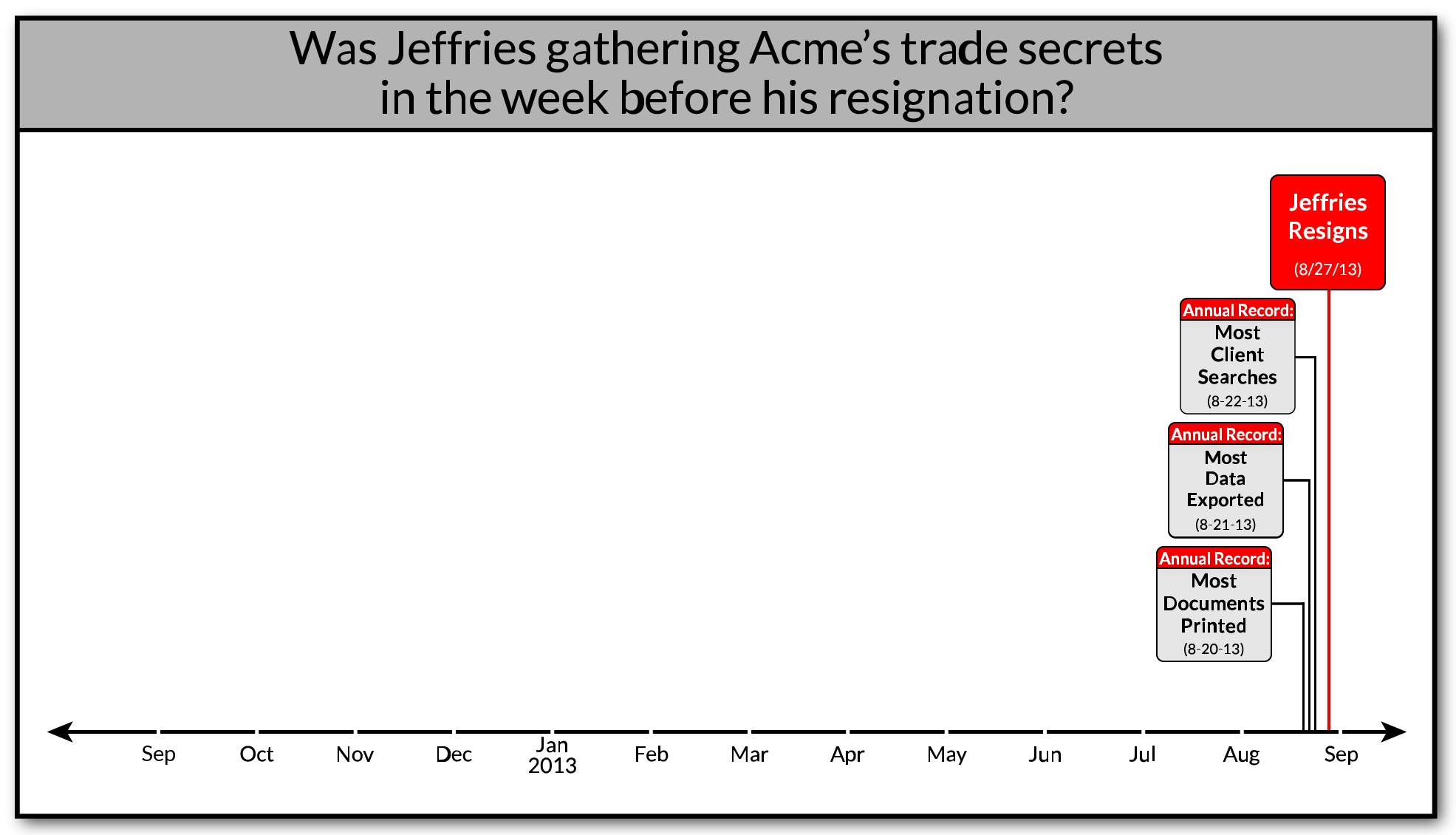
In this trade secrets misappropriation case, we used contrasting colors (red & gray) and eliminated non-essential information to direction audience cognitive perception/processing to the defendant’s unprecedented downloads, data exports, and client searches in the week before his resignation.
3. Strip away or “dull out”—reduce the cognitive salience—of all visual elements not critical to your CORE message.
This is difficult. This is where the lawyer and the designer earn their keep. This is when, “The jury or judge will definitely understand it after they’ve examined it for a while,” isn’t good enough. Because they won’t examine it for a while. And they won’t understand it.
Eliminating the chaff focuses all attention on the elements you have determined most powerfully communicate your message. I find it best to isolate each element in my mind, like a background or an arrow, and ask whether including the element is necessary to support the message—not your case or your artistic abilities, the demonstrative’s CORE message. If it isn’t necessary, get rid of it. Even that is not enough, however. To avoid communicative dilution, to laser focus attention on your message, the necessary, but not critical, elements should take a back seat. Things like using more neutral colors, reducing sizes, and addressing positioning go a long way to direct the attention to your CORE message as opposed to the delivery vehicle.
A Few Words on the Delusive “Color Mood”
Myriad articles and blog posts discuss the importance of color in visual communication, not as a function of contrast, but of a color’s inherent mood-producing impact. Red, for example, is often cited as evoking negative feelings, blue is positive, yellow is fear, and the like. Cognitive research recognizes that certain colors may produce generalized feelings in certain populations, i.e., red can induce feelings of urgency and blue that of calmness—sometimes. The problem is that the Color Mood causal relationship is neither consistent nor strong. The feelings produced vary significantly both inter- and intra-culturally: Red = Danger, Adventure (United States); Revolution, Weddings (Russia); Good Fortune (China); Nature, Government (Netherlands); Authority (England); Purity, Wealth (India); Death (Turkey). 
Eliminating the chaff focuses all attention on the elements you have determined most powerfully communicate your message. I find it best to isolate each element in my mind, like a background or an arrow, and ask whether including the element is necessary to support the message—not your case or your artistic abilities, the demonstrative’s CORE message. If it isn’t necessary, get rid of it. Even that is not enough, however. To avoid communicative dilution, to laser focus attention on your message, the necessary, but not critical, elements should take a back seat. Things like using more neutral colors, reducing sizes, and addressing positioning go a long way to direct the attention to your CORE message as opposed to the delivery vehicle.
Use Your Valuable Time Wisely
Your valuable time, and your client’s case and money, is too important to rely upon all-too-common outdated design techniques in trial demonstratives. I hope what I shared here today helps shed some light on how to build more persuasive, impactful designs.

